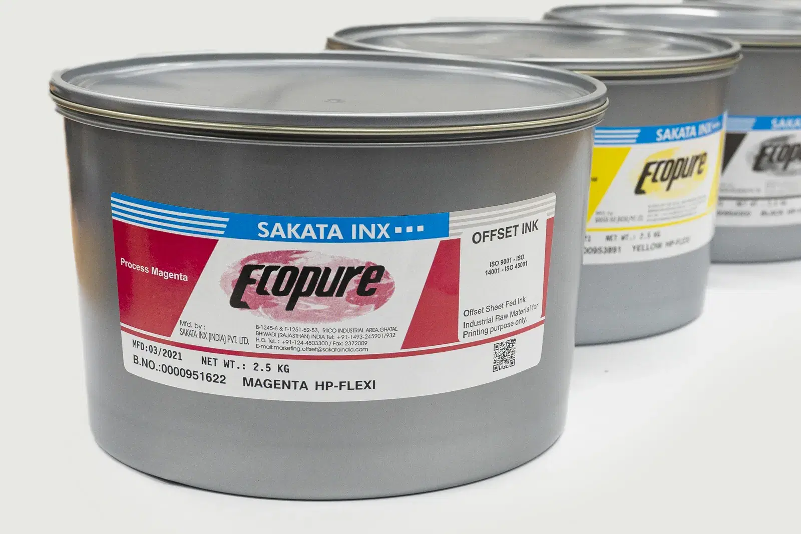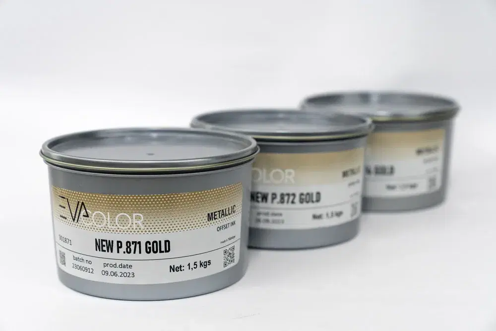
Metallic and gold inks are the only materials that give a gold or silver effect on an offset press without an extra unit or die; chosen badly, they produce a dull, dirty result that rubs off. Selection is the sum of five decisions: shade, pigment type, paper, film thickness and drying–varnish. This guide provides the PANTONE 871–877 shade table, a paper compatibility table, a comparison with hot-foil stamping and a pre-order checklist, for printers in Turkey and buyers sourcing metallic inks abroad. Products: EVA COLOR Gold, EVA COLOR Silver and SCHLENK metallic pigments and inks; for how metallics relate to other types see the printing inks hub.
01How metallic ink shines, and how that drives the choice
Metallic brilliance comes from bronze or aluminium platelets aligning flat in the ink film and reflecting light specularly. That physical fact produces every selection rule: platelets need a smooth, coated surface (gloss-coated paper) to lie flat; enough platelets need a film heavier than standard CMYK; platelets sit at the surface, so rub resistance is lower and a protective varnish is needed; larger platelets are brighter but print worse in fine screens. Brilliance is judged by 60° gloss (GU), not by the L* colour value; a quality metallic offset ink on gloss-coated paper gives 85–95 GU.
02Shade: the PANTONE 871–877 table
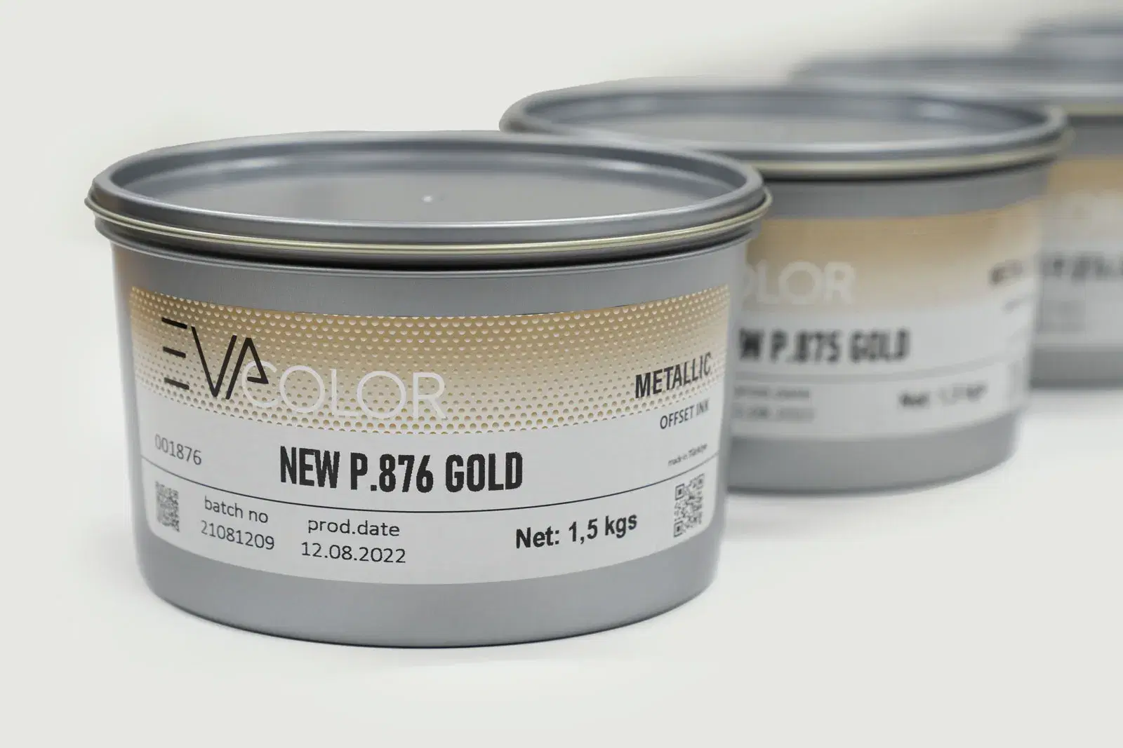
The gold shade comes from the copper–zinc ratio of the bronze pigment: more copper gives a warm, reddish gold; more zinc a pale, cool gold. The 871–876 golds and 877 silver of the PANTONE Metallics guide are the printers' common language and should be specified in the artwork as, for example, "PANTONE 872 C". The table summarises each reference's shade and typical use; the EVA COLOR Gold series is produced in ready shades matching these references.
| PANTONE reference | Shade | Pigment | Typical use |
|---|---|---|---|
| 871 C | Greenish, cool gold | Bronze (high zinc) | Corporate print, certificates, diplomas |
| 872 C | Pale, neutral gold | Bronze | Invitations, book covers, business cards |
| 873 C | Medium warm gold | Bronze | Cosmetics boxes, brochure accents |
| 874 C | Warm, reddish gold | Bronze (high copper) | Luxury packaging, beverage labels |
| 875 C | Coppery gold | Bronze (high copper) | Wine, spirits, chocolate labels |
| 876 C | Dark copper–bronze | Bronze | Premium cartons, vintage effects |
| 877 C | Silver | Aluminium | Technology, cosmetics, automotive packaging |
03Pigment: bronze or aluminium; leafing or non-leafing?
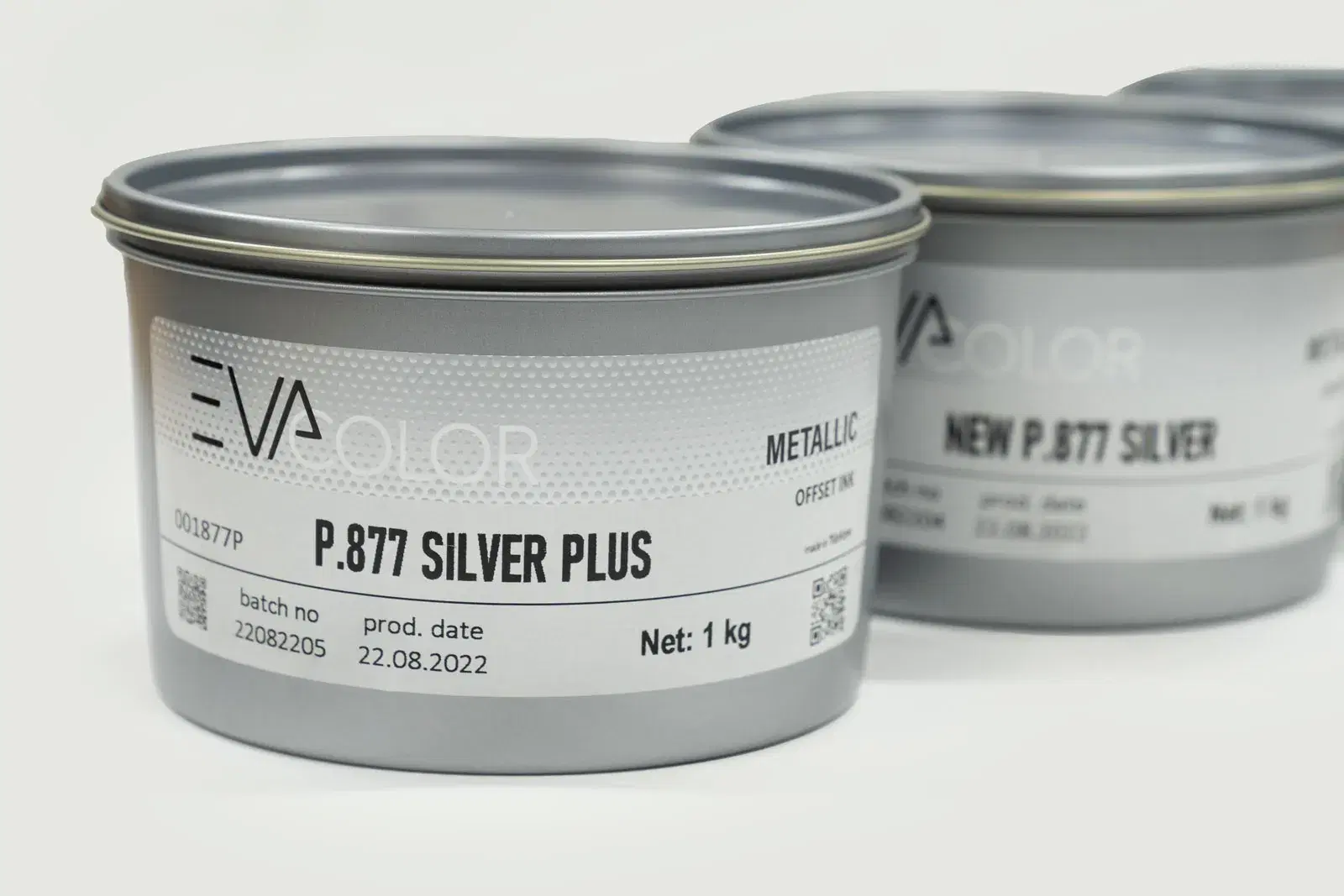
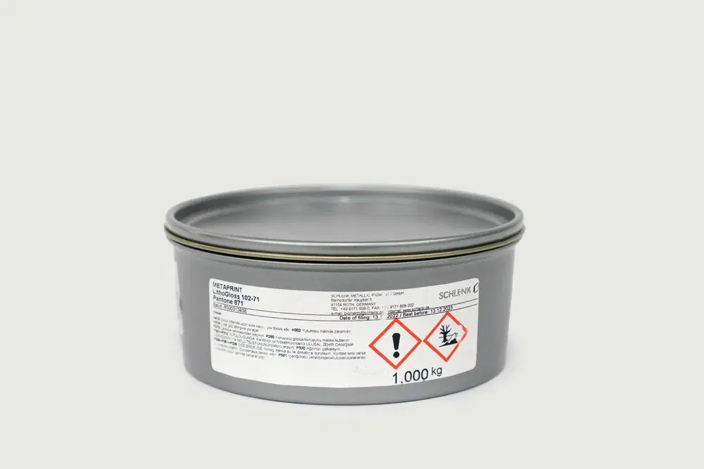
Gold shades are made with bronze (copper–zinc alloy) platelets, silver shades with aluminium. Aluminium is highly sensitive to iron contamination: iron-containing spatulas, containers and roller residues spoil the colour of silver ink, so separate equipment is used for silver. The pigment's "leafing" character (rises to the surface, high mirror effect, weak against rubbing) or "non-leafing" character (embedded in the film, accepts overprinting and varnish) is chosen by whether the job will be overprinted: non-leafing for CMYK over a metallic base, leafing for pure metallic brilliance. SIM distributes SCHLENK pigments and manufactures the EVA COLOR series with them.
04Paper and substrate: where metallic shines
The surface is the largest determinant of the metallic result. Gloss-coated paper lets platelets lie flat and gives the highest GU; on matte-coated stock brilliance can fall by 30–40 GU; on absorbent surfaces such as uncoated and kraft the vehicle is absorbed, platelets stay disordered and the result looks dull and dirty. The remedies, in order: a higher-pigment series, a primer, or a spot accent instead of a metallic background. Metallised board and plastics need a UV metallic series. The table summarises expectations and precautions by surface.
| Surface | Expected brilliance | Precaution | Varnish |
|---|---|---|---|
| Gloss-coated | Highest (85–95 GU) | Standard film; powder adjusted for set-off | Gloss dispersion varnish |
| Matte-coated | Medium (30–40 GU lower) | High-pigment series or primer | Matte/satin varnish, rub test |
| Uncoated / offset paper | Low | Primer or opaque white underprint; proof mandatory | Protective varnish recommended |
| Kraft / recycled | Low, shade shifts | White underprint + high pigment | Protective varnish |
| Folding carton board | High if coated | Flexible varnish against fold cracking | Flexible dispersion varnish |
| Metallised board / plastics | High (with UV) | UV metallic series, adhesion test, EPDM blanket | UV varnish |
05Film thickness, screen and print sequence
Metallic brilliance rises with film weight: 1.5–2 µm is optimal on gloss-coated paper; a thin film looks dull, a very thick one dries slowly and sets off. Metallics look best in solids and tones above 40%; in light screens pigment density falls and the effect is lost, so screened metallic gradations should be limited at the design stage. Print sequence matters too: the metallic is usually printed in the first unit with transparent colours on top; printing over metallic needs a non-leafing series and an adhesion test. Because metallic ink can set more slowly than process CMYK, pile height and powder are adjusted. Details are in our metallic printing techniques article.
06Drying, varnish and fastness
Because metallic pigments sit near the surface, rub resistance is lower than with standard inks; on packaging, covers and labels a protective dispersion varnish is almost mandatory. Two risks in varnish selection: some varnishes slightly yellow the metallic tone (sample first), and a water-based varnish applied over an incompletely dried metallic can displace the platelets (drying window). Fastness is verified with three tests: dry and wet rub, lightfastness (Blue Wool) and, where needed, migration for food contact. In UV metallic series the degree of cure is checked with a solvent test. In storage the can is closed tightly, an opened can gets an anti-skinning treatment, and silver is kept away from iron.
07Metallic ink or hot-foil stamping?
The decision depends on the brilliance expected, run length and detail. Hot-foil gives the highest mirror brilliance but carries die, foil and a separate process step; metallic ink is printed on the offset press in one pass, allows screened and fine-detail metallics and is more economical on medium and long runs. Practical rule: above about 5,000 cartons or labels metallic ink is usually more economical; below about 1,000 prestige pieces, foil may be preferred if mirror brilliance is the priority; the two are also combined (background in ink, logo in foil). Comparison and production details are in metallic ink production.
08Six common metallic ink problems and their fixes
Because its pigment is a plate-shaped flake, metallic ink behaves differently from conventional ink and most problems come from a press setting that ignores that. A dull, flat finish usually means absorbent paper or too thin a film: use gloss coated stock, a higher ink feed or a light underprint. Build-up on rollers and blanket points to ink-water imbalance or over-dilution: correct the water balance and keep extenders at the manufacturer's ratio. Low rub resistance is structural in metallics and the fix is a protective varnish. Colour drift of gold towards green or red is either the wrong PANTONE tone or oxidation of the bronze pigment; the right reference and timely varnishing prevent it. Dot closure and hard tonal breaks come from screen and film-thickness settings.
| Problem | Likely cause | Fix |
|---|---|---|
| Dull, non-reflective surface | Absorbent paper, thin film, wrong pigment size | Gloss coated stock, 1.5–2 µm film, leafing pigment, underprint |
| Build-up on rollers and blanket | Excess water, over-dilution, wrong wash | Water balance, additives at manufacturer's ratio, compatible wash |
| Rubs off, low rub resistance | Weak binding of metallic pigment | Dispersion or UV varnish, sufficient drying time |
| Gold changes colour | Bronze pigment oxidation, wrong tone | Correct PANTONE reference, varnish protection, prompt dispatch |
| Dot closure in screens, hard transitions | Fine screen filled by flake pigment | Coarser screen (120–150 lpi), silver + transparent for light tones |
| Set-off, marking | Slow drying, high film thickness | Spray powder, low piles, IR/hot air, planned drying time |
09Cost: what does metallic ink cost per job?
Metallic ink costs several times conventional CMYK per kilogram, but the real difference is in consumption: the thick film needed for brilliance and the low hiding power of the pigment mean two to three times more ink for the same area. Compare per job: grams per thousand sheets × price per kilogram + varnish + extra waste. Run the same calculation for hot foil with foil metres, dies and a separate pass and metallic ink wins most medium and long runs, while foil keeps the advantage on small areas and very short runs. Three decisions lower the cost: limit the metallic area in the design, use bronze tones such as PANTONE 872–874 instead of pure gold when the brilliance is sufficient, and choose surfaces that can run without varnish where the job allows. EVA COLOR gold and silver, and SCHLENK metallic inks for the highest brilliance, offer different balances of consumption and effect.
10Food packaging, fastness and regulatory requirements
For food, cosmetics or toy packaging two further criteria apply. Migration: choose low-migration metallic series within the EU 1935/2004 and 10/2011 framework, keep the ink on the non-contact outer surface and select the varnish to the same rule; details are in safe inks for food packaging. Fastness: metallic pigments themselves are light-stable, but in tinted metallics the toner pigment should reach at least 5–6 on the Blue Wool Scale, 7 for outdoor and shop-window products. Rub resistance is measured on a Sutherland-type tester and unvarnished metallics usually fall short, so a rub specification means varnish is mandatory. Ask for light fastness, rub resistance and migration compliance to be stated separately in the TDS.
11Pre-order checklist
Is the PANTONE metallic code and paper type written in the artwork? Is the paper gloss-coated; if not, is a primer or high-pigment series planned? Will the metallic be overprinted (non-leafing and adhesion test)? Will a varnish be applied; has a varnish sample been seen? Is the printing system conventional or UV (series accordingly)? If there is food contact, have a low-migration series and documents been requested? Is separate equipment reserved for silver? Have samples and the TDS been received? The answers make sure the quotation contains the right series and packaging; SIM supplies the EVA COLOR metallic series with samples and a press trial, formulates custom gold and silver shades in the laboratory and ships export orders with English TDS/SDS. For the whole material system see the printing materials guide.
Sources
Gallery
Frequently Asked Questions
- What is the difference between PANTONE 871 and 876?
- 871 is a greenish, cool, pale gold; 876 is a dark copper–bronze. The 872–875 references in between move progressively to warm, reddish gold; the difference comes from the copper–zinc ratio of the bronze pigment. Specify the code together with the paper type (C) in the artwork.
- Can metallic ink be used on matte paper?
- Yes, but brilliance drops noticeably compared with gloss-coated stock (30–40 GU) and on absorbent paper the result can look dull and dirty. A high-pigment series, a primer or an opaque white underprint improves brilliance; on critical jobs a sample print on the target paper is essential.
- Does metallic print need a varnish?
- On jobs exposed to rubbing such as packaging, covers and labels, yes: metallic platelets sit near the surface, so a protective dispersion varnish improves rub resistance and preserves brilliance. See a varnish sample first (some varnishes yellow the tone) and apply it after the metallic has fully dried.
Related Products
SIM Baskı Malzemeleri
Get a Custom Quote for Your Project
Contact us for information about our wide product range and custom color production.